Tuesday 19 November 2013
Fedora 20 Supplemental Wallpapers
Sunday 3 March 2013
My Impression of Gnome Situation
To me it seems, and with the Gnome Shell release this has become even more pronounced, that the situation around Gnome is like the situation around political parties in Czech Republic. They mostly lost touch with reality and majority of people either lost their interest in them, became their haters or their (almost) unconditional adorers. Pointing out an issue equals hating now (and yes there are some exceptions). I have lost faith. Sadly. In both. Does it need to happen to Fedora as well? If we gnomeifficate anaconda, we might end-up like this as well. Users aren't as dumb as we tend to make them. People don't want grey lives with nothing to look forward to, with nothing to choose from. With computers treating them as monkeys. I don't want an environment where I cannot choose between grey two-colour symbolic icons and colorful normal ones. Is reaching out specifically to women making them feel equal?
No, I'm not promoting choice in general. Linux is not about choice. I realize there are lines you should not cross. We cannot sensibly support two parallel audio stacks in Fedora. We cannot sensibly support Hurd or BSD kernel in Fedora. We cannot sensibly support any random combination of system libraries. But we can let user customize their HDD layout when installing. We can show them nice professional looking installer (don't get me wrong, I agree that the installer needed rewrite of its internals, I just don't agree with many of the UI changes that went along with the code redesign). We can show them KDE quality design. We can promote open standards while not setting the hurdle too high for using proprietary or patent encumbered. We can let them choose desktop background by clicking on desktop. We can let them turn off their computer. We can let them install OpenOffice without breaking LibreOffice. Are we?
Fedora Desktops – Quick Look
Hello to all.
Yesterday and today I've been working on packaging the wallpapers for Fedora 19. Since we have a couple of new desktops in Fedora, I thought it would be good to expand our coverage to them as well. In short – since Fedora 19, new wallpapers will be visible in backgrounds selectors of Gnome, KDE, Mate and Xfce. LXDE does not show any pictures and has a plain file chooser for that, Cinnamon uses Gnome stack, but has a bug in its backgrounds selector (read on), so the background is usable but not visible.
I've had various experiences with testing the packages in the desktops and as a couple of these were driving me mad, I thought I'd write a quick showcase. I needed precisely two things – terminal to install/remove the WIP packages and means to set the background. So, up to some initial word or two, this will be about how to run a terminal and how to change a background in these desktops. Also, even though I did it in new user account, widget themes might not reflect fedora defaults as I changed them at one point and I also didn't reset configuration between switching the DEs. Maybe someday I'll test default config and do a quick review of look'n'feel.
For convenience I'll review the desktops alphabetically.
Cinnamon
On first look I thought this might be good – it had panel, menu and looked almost fine. First problem was the symbolic icons in system-tray. I had no idea what half of them meant, but at least there were bubbles popping out that clarified things a bit. Desktop wasn't clickable. Menu got me mad the more I tried to work with it. I could say, from my point of view (POV), this desktop is a wasted effort. If I wanted Gnome 3 I would use Gnome Shell, if not, I don't see the point of choosing this over Mate or XFCE. For me this was even more painful experience than Gnome Shell. It was like choosing the worst features from all the desktops I tried and putting them together.
So let's look how I start terminal. First I open a menu. Ugh. A bunch of icons, three columns, the first one without any text. Huge padding. The third column changes contents on hoover in the second column. I always hated dynamic menus on web and this is not an exception. Scrollbars everywhere because of the padding and fixed height. As I rarely start apps by typing their names, actually rather dislike doing it that way, this is absolute pain for me.

Now for the desktop background. As I noted earlier, desktop is not clickable. So I had to figure out how to change it. So, let's find settings. Oh, it's one of those icons without text…

This gets me into a common interface that I know from other desktops as well. This is good. No big issue here. One tiny complaint might be that theme, desktop and background are three separate tools. Also I wonder, why it uses different icons than the rest of the desktop?

So, let's click background.

Huge. What a huge waste of space. The images are neatly small, probably the ideal size, with a nice shading to boost, but that huge white-space totally kills it. Plus point for showing image name, minus for not showing image author. Furthermore, our background is missing. Because it's XML. It's supported (as evident by it being actually used as background), but not selectable. Someone who actually uses Cinnamon should fill bug about it. The background changes on click. Space waste is common with Gnome. The All Settings button could have been on the same row with the Close one. There is no single reason why one should be at the top and the other at the bottom.
GNOME
First impression terrible. Black theme, grey washed-out symbolic icons, no pop-up bubbles, no menu. Animation everywhere. Second impression better than Cinnamon, still not usable for me. Inexplicable removing/hiding of useful features, re-adding some of them three releases later, sometimes adding unneeded steps in-between (read on for more info on this). However it's actually usable desktop. It would be a pain for me, but it would probably be easy to use for my grandma, for kids used to touch interfaces on iPads, for game console or for browsing the internet (after all, it basically behaves like something between the web and modern Android-powered phones and it uses web technologies like javascript and css *ugh*).
Now on to the terminal. First go to top-left to open activities. Empty. As its primary task is probably switching between windows, I haven't entered any menu yet. First I have to click on the icon that looks like grid nodes (what's the idea? It does not even remotely suggest that this will get me app list).

Huge. So I finally got into the menu. With huge icons and (when compared to the icon size) small text. Weird looking scroll-bars everywhere. So next step is select category (you don't expect me to find Terminal among zillions of uncategorized apps, right?) and find terminal. Animations everywhere.

It's better than cinnamon, but the two steps to get into menu are strange and ineffective. Gnome Shell isn't optimized for using mouse. But lets continue to background selection. This is the worst background selection I've ever seen. I think the following four pictures speak for themselves, but let's explain a little bit first. So again, desktop is not clickable so I need to go through control center. Let's skip for now the fact that I don't see Theme or Appearance there (maybe I forgot to install something), the control center is categorized (like in XFCE) and Background is there. No issue from me. Kudos for the categorization. But then, after selecting Background, a completely useless window appears. It just shows the desktop. Whoa. Does that mean there are no pictures to select from? No. The desktop is actually clickable. I don't understand why this single step is included. It obviously extraneous, unneeded, confusing. Then the selection itself normal. I can select from installed backgrounds, pictures from XDG_PICTURES or plain color. The UI could be better, it could be worse, but it serves its purpose. The pictures are big, but there isn't too much of white space in between them, so no issue. However. Neither picture name, nor its author is present. Fail. The background does not change until I click Select.


One common thing about gnome and cinnamon is it's use of awful flat grey everywhere. No single hint of colour or shaded gradient. In sheer contrast to the next DE.
KDE
This takes a lot of time to actually start, but then you are finally welcomed by a desktop that looks like designed by an artist. Yes. This is the only Fedora desktop that looks great and consistent. It can be clearly seen the theme has been designed by professionals and lots of time has been invested in it. For my taste it has too much animations, but knowing KDE it can be probably turned off. UI is another story though. Not my cup of tea, but about half of linux users like this, so I'll say it's good and detailed but for me it offers too much detail, it easily becomes overwhelming. It does not usually waste space. This is a desktop I could use after a bit of customizing.
Now let's start terminal. Like many people are used to from file managers, right-click on desktop offers you to start terminal in KDE. So +1 from me.

Another way is through menu. The design is similar to cinnamon, but works better. It looks like cinnamon took the idea from KDE, kept its worst parts (fixed size, scrollbars anywhere, change menus on hoover) and made it even worse by adding gnome-like bits. While it behaves menu like, it's still in the same place, things get replaced, and due to fixed size, scrollbar is not uncommon. This is one of the worst parts of KDE, from my POV, but unlike Cinnamon or GNOME it does not get on my nerves.

To change desktop wallpaper, right-click on it and select Default Desktop Settings. I don't fathom the word Default in the name, but other then then all cool. What comes up is finally something that has done things right.

The image sizes are reasonable, white space is neither too big nor too small and most importantly, it shows both name and author of the wallpaper. Let's repeat it because it's important. KDE is the only Fedora desktop environment that shows both wallpaper name and its author in its Desktop Background selection app. This is how it should be done. The only thing that would make it even better would be to also show the license. You need to click Apply to change the background.
LXDE
Lightweight desktop with all it takes. It's fast, it works, but it's simple. Configuration might take longer than in other DEs but it looks like highly usable desktop if you don't mind less features. Now let's start terminal. Finally a sensible categorized menu without scroll-bars. As expected, terminal is quickly found.

Changing the wallpaper is also standard. Right-click on desktop and select Desktop Preferences.

The selector itself is light weight. No previews, just a file chooser and a few more options. Cannot probably expect much more from a lightweight desktop, right? And it does it's work without any unnecessary steps.

Mate
A direct continuation of a desktop I used to use. This is fork of Gnome 2 with the intention to provide and upgrade Gnome 2 experience and as such it behaves. Nothing unexpected. Menus work as usual, icons have colour, things are usually efficient. I still could use this, but nowadays I prefer XFCE. So let's start terminal. It's almost the same as in LXDE.

Nothing really wrong here, but too big icons and too much padding. If you have small screen or many apps, scrollbars appear. There's an option to start it from desktop context menu like in KDE as well.

Same goes with desktop settings. Directly accessible from desktop context menu. This is what we get.

Image size good, padding could be smaller, but just like with GNOME – no name, no author. Fail. Wallpaper changes on click.
Xfce
I'm not sure in which category this falls. It's not lightweight like LXDE, it's similar to gnome 2, but it's not gnome 2 ;-) Currently my desktop of choice so I skip on praising this time, only one note – the default config looks "bleh", but its actually highly tweakable and after some time it can be made look really good (although partly due to the lack of really professional looking GTK2/3 themes not as good as KDE). Starting terminal in XFCE is quickest of all the DEs I've tried thanks to special launchers to "Preferred Applications" that are also included in default bottom panel.

It can be also started from menu. It's similar to Mate, but it's all-in-one solution. There isn't separate menu for Settings and Administration. The icons are smaller, there's less padding so it takes much longer for scrollbars to appear. This is what I like the most.

Terminal can also be stared from desktop context menu.

Background selector can be run from the same place as well. This is what it looks like.

No waste of space, preview included, simple selector. No name, no author, but filename is present, so while it isn't fail, there's still lots of room to improve. Wallpaper changes on select.
Conclusion
While I was writing this, I realized that even though I write it alphabetically, it also reflects how I like the DE I write about – the first one least, the last one most. Interesting coincidence. If I had to draw some conclusion I'd say that traditional desktops are very good for starting applications, terminal especially, KDE is midway and GNOME and Cinnamon lag behind. I think the change from menu to something else is making things worse rather than better (this counts for Windows 7 as well, I find it very hard to find an app I want to start there without using keyboard). When selecting background, KDE is the obvious winner with both being quick and easy and providing most of important information. Gnome and Cinnamon both fail tremendously in this. Last, when it comes to design, KDE is the obvious winner with a very professional polished look, traditional GTK2 based desktops are so-so with lots of room for improvement, Cinnamon and GNOME are terrible and very amateurish from my POV.
So in short, while I use Xfce, and will continue doing so, from this short comparison, KDE comes out as the winner.
Wednesday 27 February 2013
Consistent Perspective in a Group of Icons – How To
I've been creating a bunch of Echo icons lately and one thing I wondered how to do properly is perspective. It's easy to do thinks consistently if you're using some kind of metric projection (e.g. isometric), because you have simple linear transformations from (X, Y, Z) to (x, y). That's not true for perspective. How the 3D projects to 2D depends on the shape, on the position, on the size and many more factors when projecting with perspective. Because I was creating many icons at once, all flat ones with constant thickness, I wanted to do this not only consistently, but also quickly. I've came up with the following workflow.
Start with drawing the front face of the icon on the canvas, just like if you were drawing pure 2D.
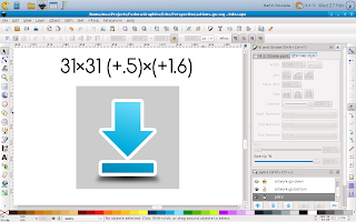
Then duplicate the canvas as well as the icon shape. Don't forget to change colours so that you can easily tell them apart.
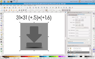
Next change the size of them by some factor and use the same factor for every icon you create and is supposed to have the same thickness. The resize should be done to both canvas and the icon shape at the same time so that it scales properly, keeping the ratios and position of the icon on canvas.
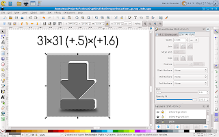
Then move the resized canvas together with the icon shape to it's new position. Again this has to be done consistently for all icons with the same thickness. You can imagine that the original and edited canvas create together some kind of cuboid whose front and back faces are squares, even in the 2D projected image its thickness regulates thickness of the icons and the relative position of its back side to the front side controls your point of view.
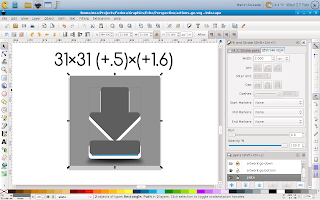
Next delete the changed canvas (we don't need it anymore) and put the back side of the icon behind the front one.
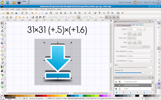
Next you should remember that you're doing an icon so it should be properly aligned to pixel grid in order to look crisp. This can be done quickly with the help of inkscape grid feature.
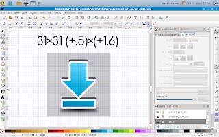
Now we have front and back side of the icon, but we still don't have it's sides, as can be seen on the next picture.

The easiest and for simple icons also the best way to do them is to duplicate the front side again, merge it with the back side and fix those bumpy parts to look as you'd expect them using the node tool.
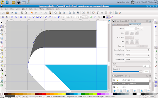
Now the icon is only missing some shading and outline.
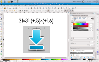
So next we add some gradients to make it look as we wish – this can be a tedious task, depending on how realistic we want the icon to look. On small size like this one it can be greatly simplified though. And finally we add an outline. This can be done by duplicating the edited shape again, adding an outline that is twice as wide as we want it to be (because half of it will be hidden) and push it bellow the whole icon. The result looks like this:
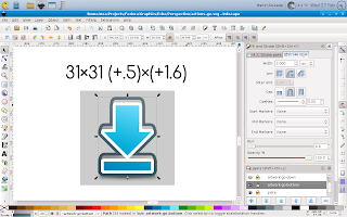
Finally we render the icon in desired size with transparent canvas and it looks like this:

I hope you like my today's how-to :-) Also, bear in mind that this is greatly simplified perspective projection as we use it in icons, if you were going for fully realistic painting you'd quickly find this workflow isn't suited for such task.
Monday 11 February 2013
[New Fedora Package] Tagaini Jisho – A Japanese dictionary and study assistant
Dear fellow Japanese language students, rejoice. I've been using the app in title for a while, but I finally got around to do a proper Fedora package and push it to Fedora ;-) So installing is now super easy.
- For Rawhide:
su -c 'yum install tagainijisho' - For Fedora 17 and Fedora 18 (I decided not to support Fedora 16 as it's going to be EOLed shortly):
su -c 'yum install tagainijisho'
Tagaini Jisho is a cool piece of software, an irreplaceable tool for anyone learning Japanese. You can use it not only as a Japanese-%{your-language} dictionary/kanji search tool, you can also use it to learn the words, and to learn the Japanese characters. Hiragana, Katakana, Kanji – all included, and with animated stroke order diagrams! More info on www.tagaini.net. Some screenshots bellow:
Update 2013/02/21: Tagaini Jisho has been tagged to stable repos for Fedora 17 onward. The issue with dictionaries mentioned in comments is also fixed in that push. Enjoy!
Thursday 7 February 2013
(XFCE) Terminal and XChat Colour Scheme
I'm a regular terminal user and with F18 I switched back from Sakura to XFCE Terminal, because for some reason sakura refused to get configured as before (I think I wasn't able to remove window borders anymore)—I prefer terminal in some kind of semi-full-screen mode, i.e. maximized (but with DE panel[s] still visible), without menu, without window borders, without scrollbars. And while I was at the configuring, I decided to change the default colour scheme. It's not like I particularly dislike it, but as a regular mc (midnight-commander—there isn't a better file manager out there) user, I kinda grew to dislike the blueness of the default blue and some kind of colour combinations weren't exactly easy to read (hinted fonts are partially to blame for that though, by design). So first I searched a bit over the net, but didn't find anything satisfactory, so I decided to adapt Echo Icon Theme Palette for terminal use (black terminal, I've also prepared a bright/inverse version for xchat). First how it looks:
And now for the actual colours. Here's an excerpt from ~/.config/Terminal/terminalrc:
BackgroundMode=TERMINAL_BACKGROUND_TRANSPARENT
BackgroundDarkness=0.950000
ColorPalette1=#000000000000
ColorPalette2=#b4b400000000
ColorPalette3=#0000aaaa0000
ColorPalette4=#cbcb7c7c0000
ColorPalette5=#00003f3f6868
ColorPalette6=#bfbf0000efef
ColorPalette7=#0000a61dd074
ColorPalette8=#c6c6c6c6c6c6
ColorPalette9=#5ef75ef75ef7
ColorPalette10=#ffff52990000
ColorPalette11=#9393dada0000
ColorPalette12=#ffffe1e13939
ColorPalette13=#00007373a2a2
ColorPalette14=#dbdb8181ffff
ColorPalette15=#8181e3e3ffff
ColorPalette16=#ffffffffffff
ColorForeground=#c6c6c6c6c6c6
ColorCursor=#c6c6c6c6c6c6
TabActivityColor=#00003f3f6868
ScrollingSingleLine=FALSE
You can notice I also included ScrollingSingleLine=FALSE—that makes shift+arrows work in mc to select items ;-)
And now from ~/.xchat2/colors.conf
color_0 = 0000 0000 0000
color_1 = ffff ffff ffff
color_2 = 5050 d8d8 ffff
color_3 = 5b5b b5b5 0000
color_4 = ecec 2828 0000
color_5 = d7d7 a1a1 3c3c
color_6 = d4d4 6767 ffff
color_7 = b4b4 0000 0000
color_8 = 6666 3c3c 0000
color_9 = 0606 9090 0000
color_10 = 0000 7373 a2a2
color_11 = 0000 3f3f 6868
color_12 = 0000 adad dbdb
color_13 = bfbf 0000 efef
color_14 = 5e5e 5e5e 5e5e
color_15 = 3030 3030 3030
color_16 = 0000 0000 0000
color_17 = ffff ffff ffff
color_18 = 5050 d8d8 ffff
color_19 = 5b5b b5b5 0000
color_20 = ecec 2828 0000
color_21 = d7d7 a1a1 3c3c
color_22 = d4d4 6767 ffff
color_23 = b4b4 0000 0000
color_24 = 6666 3c3c 0000
color_25 = 0606 9090 0000
color_26 = 0000 7373 a2a2
color_27 = 0000 3f3f 6868
color_28 = 0000 adad dbdb
color_29 = bfbf 0000 efef
color_30 = 5e5e 5e5e 5e5e
color_31 = 3030 3030 3030
color_256 = ffff ffff ffff
color_257 = 0000 7373 a2a2
color_258 = 0000 0000 0000
color_259 = ffff ffff ffff
color_260 = cccc 1010 1010
color_261 = 0606 9090 0000
color_262 = 0000 7373 a2a2
color_263 = 5b5b b5b5 0000
color_264 = 5e5e 5e5e 5e5e
Hope it's useful to other people than me as well. I find it both easier on eyes, and having better readability (with the font I'm using, it seems this one is important too).
PS: For those wondering about some differences of my desktop compared to previous screenshots—when trying out CentOS 6, I got addicted to analog clock ;-) And a little while before I decided to hide the bottom panel automagically to have more space for apps.
PPS: My apologies for having some comments in my moderation queue for too long, somehow I wasn't notified via mail, or missed them. I definitely don't censor, the moderation is for spam purposes only (or for cases were people post the same reaction multiple times).
Update (2013/08/08): In Fedora 19 (and newer), the xfce terminal config is in different place and colours are specified slightly different. Here's excerpt from ~/.config/xfce4/terminal/terminalrc:
ColorPalette=#000000;#b40000;#00aa00;#cb7c00;#003f68;#bf00ef;#00a6d0;#c6c6c6;#5e5e5e;#ff5200;#93da00;#ffe139;#0073a2;#db81ff;#81e3ff;#ffffff
ColorCursor=#c6c6c6c6c6c6
TabActivityColor=#00003f3f6868
ColorForeground=#c6c6c6c6c6c6
Wednesday 16 January 2013
[Solved] Fedora 18 Troubles – terribly slow
However, after restart, everything login related is slow. The display manager takes 50s to start (with next to no CPU and HDD usage!), the same goes to XFCE start up, the same happens after hitting logout, it takes a really long time for the logout dialog to appear, only to see that I cannot restart, I cannot reboot (these two are greyed out), I cannot sleep nor hibernate (these two buttons aren't preset at all!). The same happens with lightdm as well as kdm, I haven't tried the others yet. Pointers to what might be wrong appreciated, as of now I have no idea whether it could be a config option or a bug and where :(
Thanks to all my kind readers' suggestions in advance. Most of other things (I tried claws and midori so far), works normal, so the system is at least usable when finally loaded.
Solution:
After some more digging, I learned that polkit and upower services weren't running (they failed to start). Reinstalling the relevant packages fixed the issue:
# yum reinstall polkit\* upower

# restart


